Understanding the Fundamentals of Responsive Web Design
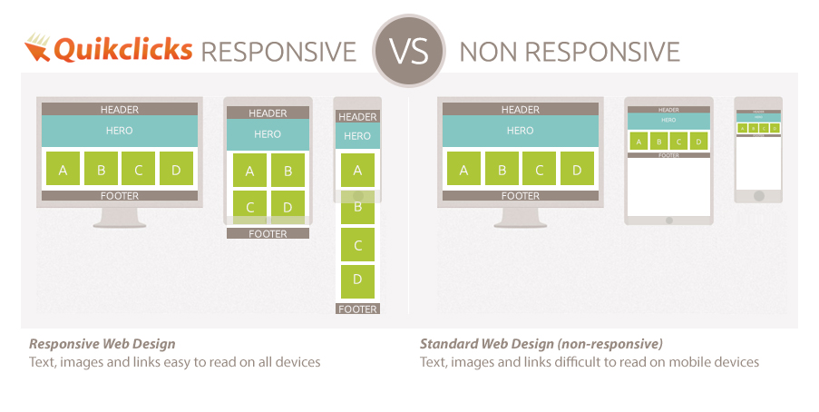
Responsive Web Design is an essential practice in modern web development, focusing on creating websites that provide optimal viewing experiences across a wide range of devices, from desktop computers to mobile phones. It involves using flexible grids, layouts, and images, along with CSS media queries, to ensure that the content adapts seamlessly to different screen sizes. Rather than designing separate sites for various devices, responsive design allows for a single, fluid layout that enhances user experience and improves loading times.
To successfully implement Responsive Web Design, developers should consider the following key principles:
- Fluid Grids: Use relative units, like percentages, instead of fixed units, to create a flexible grid that adjusts to the screen size.
- Flexible Images: Ensure that images can scale within their containing elements, preventing overflow issues on smaller screens.
- Media Queries: Apply different styles for varying screen sizes using CSS techniques that detect the device's properties.
Top 5 Techniques for Effective Responsive Design
In today's digital landscape, creating a seamless user experience across devices is essential. One of the top techniques for effective responsive design is implementing a fluid grid layout. This approach uses relative units like percentages instead of fixed units like pixels, allowing elements to resize proportionally as the screen size changes. By combining fluid grids with media queries, web designers can ensure that images, text, and other design elements adapt smoothly to any device, enhancing usability and engagement.
Another vital technique is utilizing scalable vector graphics (SVGs) for icons and images. Unlike traditional raster images, SVGs maintain their clarity and sharpness at any screen resolution, making them ideal for responsive design. Additionally, incorporating flexible images that adjust to their containing elements further improves the adaptability of your design. By focusing on these techniques, designers can create a cohesive and visually appealing experience that resonates with users, regardless of the device they are using.
How to Test Your Website's Responsiveness Across Different Devices
Testing your website's responsiveness across different devices is crucial to ensure an optimal user experience. Start by utilizing responsive design testing tools that simulate how your site appears on various screen sizes, such as smartphones, tablets, and desktops. Some popular tools include BrowserStack and Responsive Design Mode in Google Chrome. By using these tools, you can quickly identify layout issues and make necessary adjustments to your site’s CSS and HTML for seamless performance on all devices.
After testing your site with digital tools, it's equally important to conduct manual testing. This involves physically accessing your website through different devices such as iPhones, Android smartphones, tablets, and laptops. During this process, pay attention to elements like navigation, readability, and overall layout. You may also want to gather feedback from real users to understand their experience better. By combining both automated and manual testing methods, you can ensure that your website is fully responsive and user-friendly across different devices.