The Power of Visual Data: How to Turn Numbers into Impactful Stories
In today's data-driven world, visual data has emerged as a powerful tool for storytelling. Numbers alone can often fall flat, but when presented visually—through charts, graphs, or infographics—they transform into compelling narratives that resonate with audiences. By leveraging data visualization, we can highlight trends, make comparisons, and illustrate complex ideas in a way that is not only digestible but also engaging. The impact of visual data can be seen across various fields, from business to education, where conveying information effectively is crucial.
To turn numbers into impactful stories, consider employing a few key techniques:
- Choose the right type of visualization: Different data calls for different types of visuals; pie charts for proportions, line graphs for trends, and bar charts for comparisons.
- Focus on the narrative: Every dataset has a story to tell; isolate the most critical points and design your visuals to highlight those.
- Make it accessible: Use colors and labels thoughtfully to ensure your visuals are easy to understand at a glance.
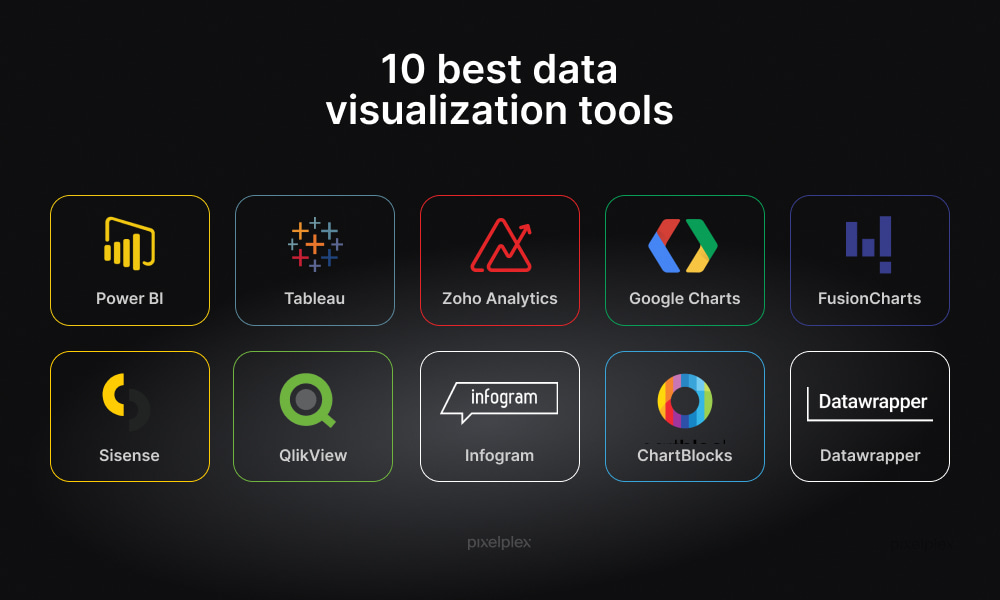
10 Data Visualization Tools to Enhance Your Storytelling Skills
In today’s data-driven world, effective storytelling is crucial for making your message resonate with your audience. Utilizing data visualization tools can significantly enhance your storytelling skills by transforming complex data into clear, engaging visuals. Here are 10 powerful tools that can help you tell your data story more effectively:
- Tableau - A leader in data visualization, Tableau allows you to create interactive, shareable dashboards.
- Power BI - Microsoft’s Power BI is perfect for integrating real-time data and creating intuitive reports.
- D3.js - This JavaScript library gives you the flexibility to create stunning, customized data visualizations.
- Google Data Studio - An excellent choice for turning your Google data into informative, actionable dashboards.
- Infogram - Infogram is user-friendly and particularly good for infographics and interactive charts.
- Chart.js - A simple and flexible JavaScript charting library that allows for responsive design.
- Plotly - Ideal for creating complex statistical graphs with ease.
- Venngage - This tool focuses on infographics, helping you communicate large amounts of information visually.
- Canva - While primarily a graphic design tool, Canva also offers extensive data visualization capabilities.
- Microsoft Excel - A classic tool that, when used creatively, can still produce effective visualizations.
Why Visual Storytelling Matters: Engaging Your Audience Through Data
Visual storytelling is a powerful tool that transforms the way we present data to our audiences. In an age where attention spans are dwindling, engaging your audience requires innovative approaches. By incorporating visuals, such as infographics, charts, and videos, you can convey complex information in a digestible and compelling manner. Not only does this capture attention, but it also aids in retention, as our brains are wired to process images far more quickly than text. Thus, utilizing visual storytelling can significantly enhance comprehension and engagement, ultimately leading to a more informed audience.
Moreover, effective visual storytelling ensures that data is not just seen but felt. When you present statistics or facts, combining them with engaging visuals creates an emotional connection with your audience. For instance, consider utilizing case studies or real-life examples alongside your data visuals. This approach not only illustrates the potential impact of the information but also encourages your audience to take action. Remember, when your audience can relate to the story behind the data, they are far more likely to engage, share, and remember your content.